To benchmark the rendering performance of several HTML SVG tools, I decided to visualize my social graph using data from the Sina Weibo (Microblog) API. The goal was to map the relationships between myself, my “friends” (people I follow), and my “followers.”
The Basic Graph
Assuming I am the central node, with my friends and followers acting as connected nodes, we get a simple visualization like Figure 1.
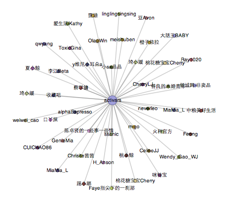
Figure 1 (Click to enlarge)
In this graph:
- Each person represents a node.
- I am located at the center.
- The size of a node (“weight”) increases based on the number of connections. Since the central node connects to everyone, it is the largest.
However, Figure 1 is limited. It fails to distinguish the type of relationship. For example, it doesn’t show if a node is a mutual friend or just a one-way follower.
Expanded Relationships
Figure 2 and Figure 3 provide a more detailed view.
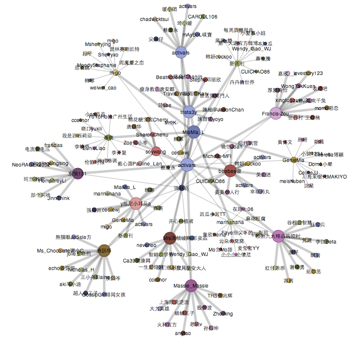
Figure 2 (Click to enlarge)
Figure 2 incorporates a second layer of data: friends of friends.
Using a weighted visualization algorithm:
- Large Node (Center): Me.
- Medium Nodes: Mutual friends (people I follow who also follow me back).
- Small Nodes: One-way connections (followers I don’t follow back, or vice versa).
- Tiny Nodes (Periphery): The friends of my friends.
Figure 3 is similar to Figure 2 but includes additional data points from the second and third layers, with user IDs removed for a cleaner abstract look.
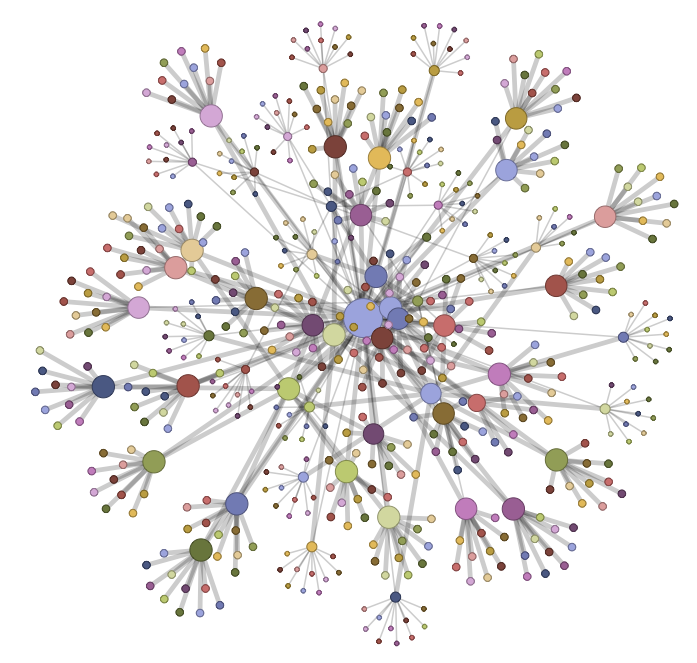
图3 (点击图放大)
层数增加会大幅度增加HTTP Requests的数量(加上新浪的服务器Response真的很慢), 图3形成大约用了1分钟调用的时间。个人好奇的尝试了一下绘图工具的极限,调用了所有的个人好友(最多100位,我暂时只有70多位粉丝和朋友),并且调用朋友的朋友(<100),最多的节点数量小于100*100, 这样构成了图4。 由于节点过多使得Google Chrome异常的缓慢,所以去掉了连接线,可是还是几乎不能与构成的图形互动。从新浪微博调用图4的数据大约用了15-20分钟左右的时间(~= 去餐厅买中饭 + 上厕所 + 冲咖啡)。
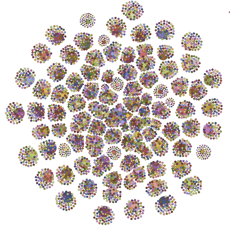
图4 (点击图放大)
有密集物体恐惧症的朋友们看了会觉得图4异常的恐怖(同情你们, 我自己看多了也觉得很反胃)。这就是我的新浪好友关系图,或者可以把它看作是一副个人艺术品。
最后粗略的总结SVG rendering performance on MaxOSX,从低到高排列: FF 3.6.10 < Safari 5.0.2 < Google Chrome 6.0.472.63 .
Leave a comment