There is a famous quote often attributed to Pablo Picasso:
“Good Designers Copy, Great Designers Steal”
However, the art of “stealing” a design requires understanding the context behind the original elements. A designer must understand why a design works before incorporating it into their own work. Mindless copying often leads to a disjointed product or a jarring user experience.
Sina Micro Blog (Sina Weibo) is essentially a clone of Twitter, tailored for the Chinese market. While it has successfully adapted the core features, a closer look reveals several questionable design decisions, especially when compared directly to the original Twitter iPhone application.
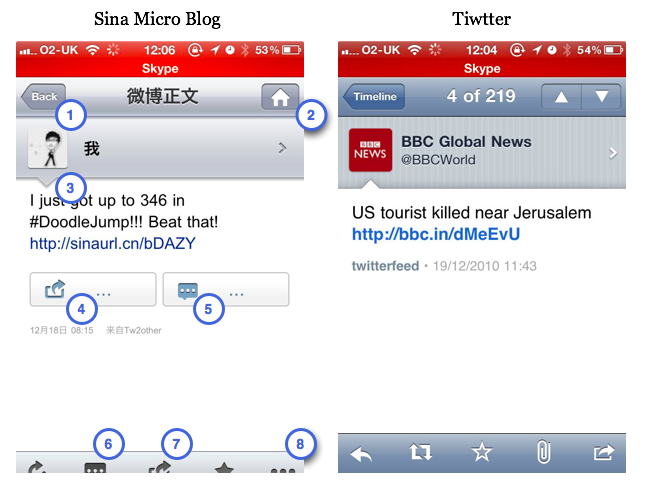
The image above shows the Sina Micro Blog app (left) and the Twitter iPhone app (right). Both are displaying the detail view of a single status update. I’ve marked specific elements on the Sina interface to highlight the design issues discussed below.
Duplicated Functionality
Unlike desktop interfaces, mobile screen real estate is at a premium. Every pixel counts.
- Redundant Navigation: Button (1) is a standard “Back” button, while Button (2) appears to be a “Home” or “Close” button. In this specific view, both actions result in the exact same outcome: effectively popping the current view from the stack to return to the tweet list. Why burden the user with two controls for the same action? The Twitter app handles this more elegantly by labeling the back button with the destination (“Timeline”) and using the right side for up/down navigation.
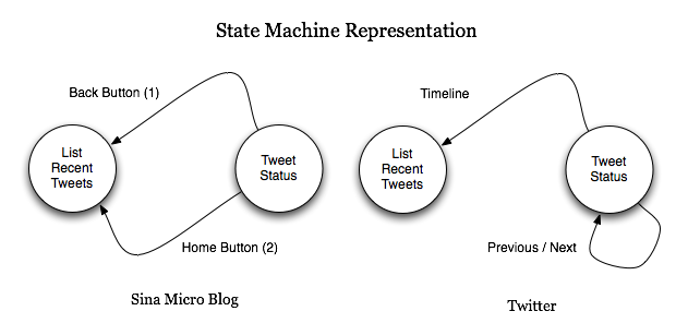
If we model the UI navigation as a state machine, the Twitter app (right) presents a deterministic workflow: there is one clear path to return to the previous state. The Sina app confuses the user with redundant paths.
- Confusing Button Order: Buttons (4) and (6) both seem to relate to replying or redirecting messages, but their placement and inconsistent ordering relative to other buttons (like (5) and (7)) create cognitive friction.
Inconsistent Iconography
A fundamental rule of UI design is consistency.
- Same Icon, Different Function: Button (5) and Button (6) use the exact same icon (a speech bubble). However, (5) displays the list of comments, while (6) is used to write a comment. Using identical visual markers for different actions forces the user to memorize position rather than rely on intuition.
Cluttered Actions
- Fragmented Sharing Options: Button (7) redirects (retweets) the current message. Button (8) also offers redirection but includes other channels (Email, SMS). It would be far more efficient to group these into a single “Share” action sheet. The interface feels cluttered with buttons that perform slight variations of the same task. Grouping them would declutter the UI and make better use of the limited space.
Visual Semantics
Design elements convey meaning.
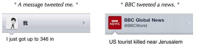
- The Speech Bubble Tail: In the Twitter app, the speech bubble (the tweet container) has a tail pointing down to the user’s avatar, visually indicating “this person said this.” In the Sina app, the tail is inverted or positioned awkwardly. The designer likely attempted to differentiate from Twitter’s look but lost the semantic meaning of the graphic in the process.
Implementation Quality
- Layout Adaptability: You may notice the bottom toolbar in the Sina app is partially cropped. This screenshot was taken while the “In-Call Status Bar” (the green bar indicating an active call or background task) was active. The iOS interface shifts the view height, and a well-implemented app should handle this layout change automatically. The fact that the toolbar is cut off suggests the view might have been constructed with rigid, absolute positioning in Interface Builder rather than using proper autoresizing masks or layout constraints.
The Shared Goal of Design and Code
It is always instructive to deconstruct applications to learn from both their successes and failures. The challenge of product development is bridging the gap between design and engineering.
Both coding and design share the same ultimate goal: to solve the user’s problem and make their life easier. When we place buttons thoughtlessly or ignore platform conventions, we fail that goal.
Leave a comment